Jiko
An institution and an innovator
Web
Design
Branding
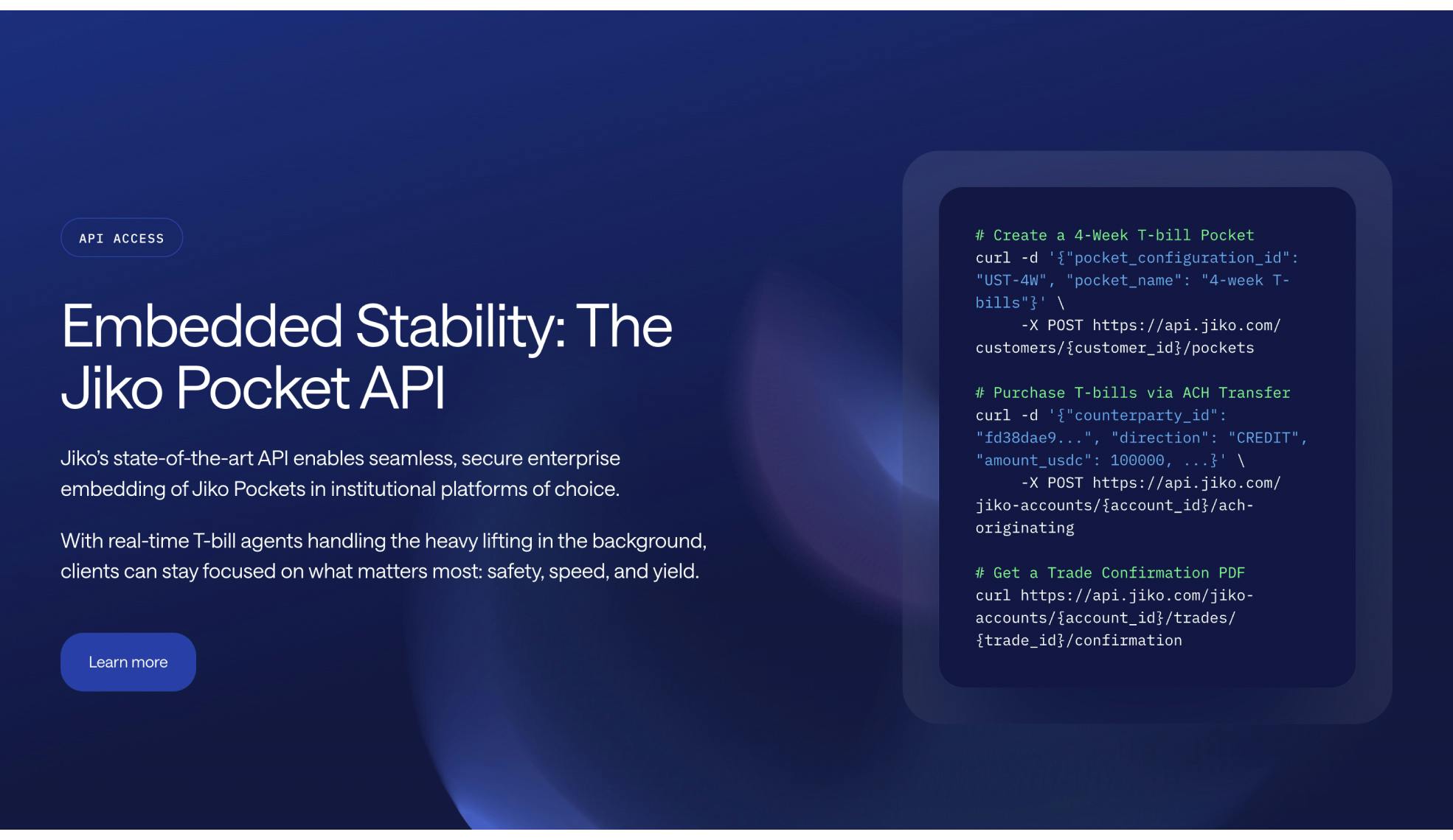
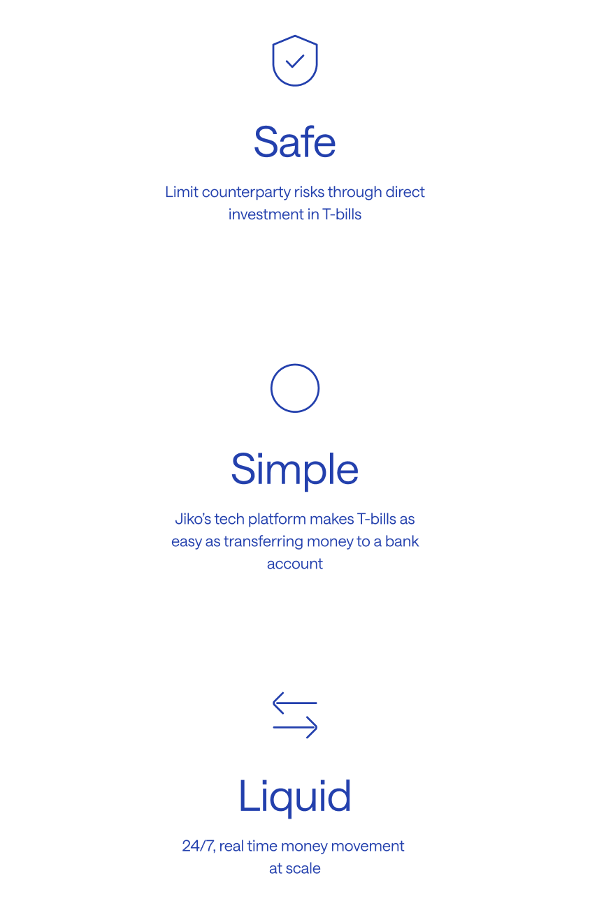
Jiko offers its customers automated investment in U.S. Treasury bills, with 24/7 liquidity and the user experience of a regular bank account.
A brand refresh
Jiko is based in the U.S. and in Reykjavik, Iceland, where the development team is located. We've worked with them on a variety of projects, mainly related to the product side of things, and this time around we took on the project of refreshing their brand and building a new website.
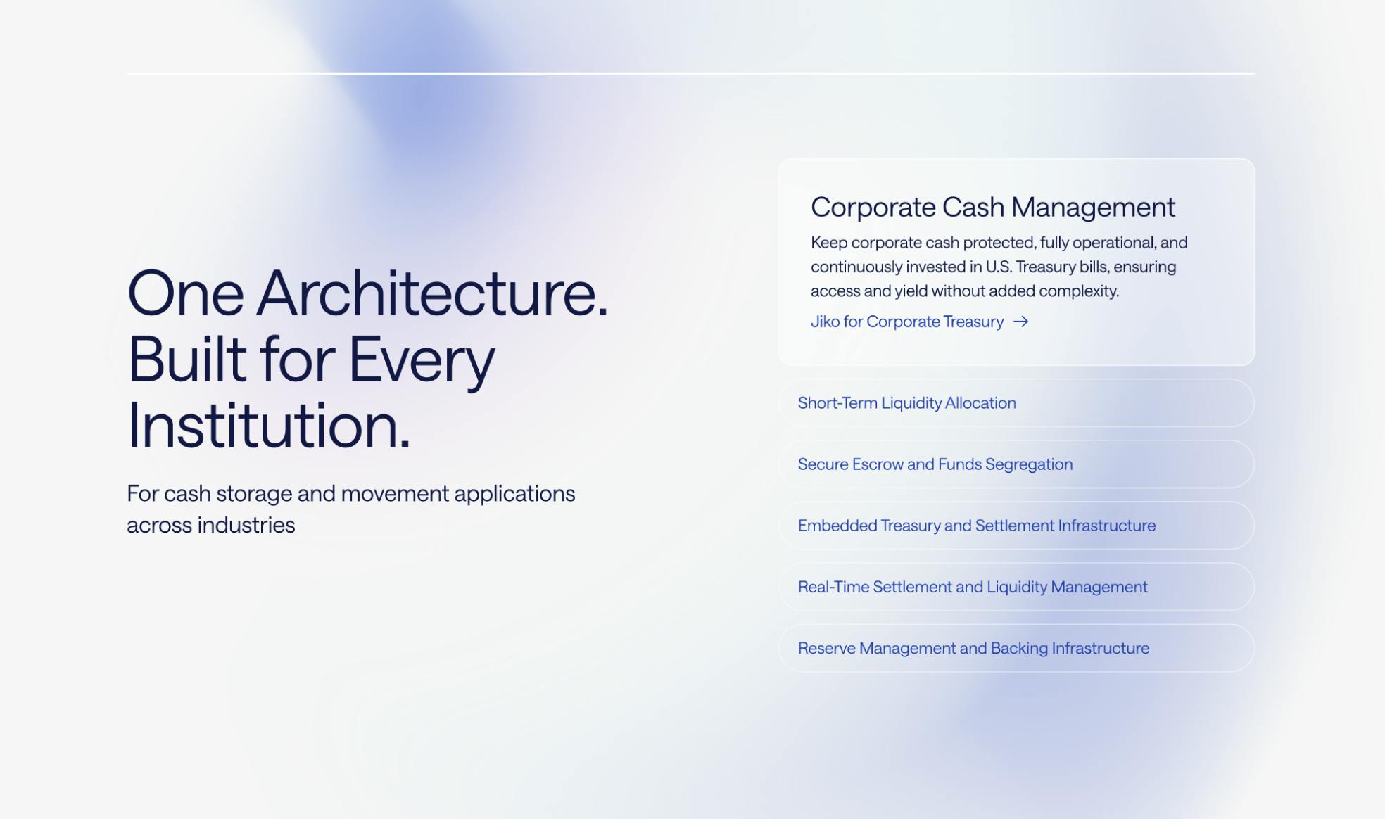
The goal for the brand refresh was to dial in Jiko's market positioning, and figure out how to best connect with two different target groups; treasury teams in corporations that are responsible for managing large pools of cash, and on the other hand tech industry decision makers who could benefit from building their own services on top of Jiko's platform.
Two sides
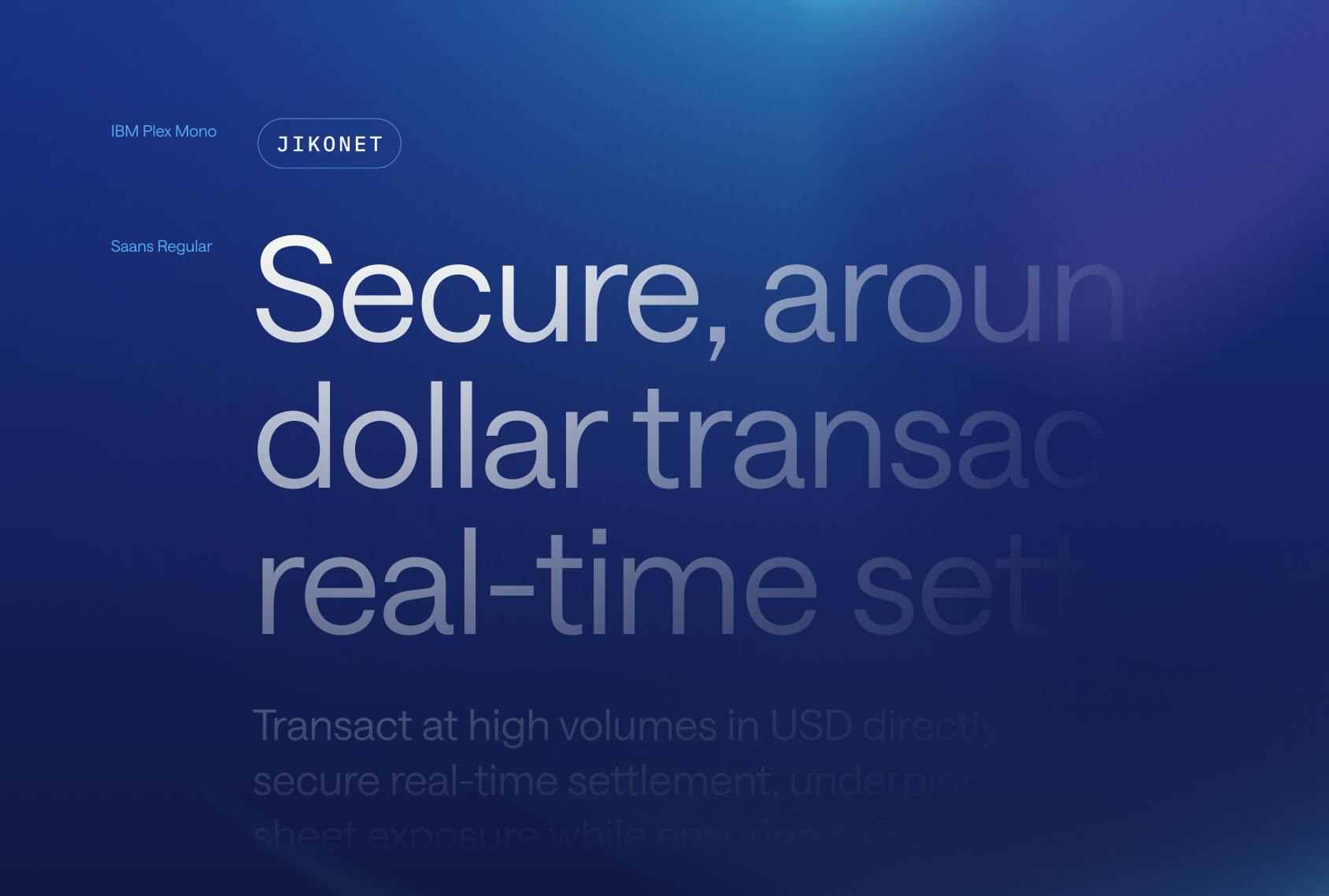
We kept the color palette fairly conservative, with blue hues and a sand base, adding a cyan for a pop of tech. The typeface is Saans from Displaay Type, a clean, modern sans-serif that works with the colors to balance the two sides of Jiko; a registered bank and a serious financial institution, but also an innovative fintech startup.

Two parts
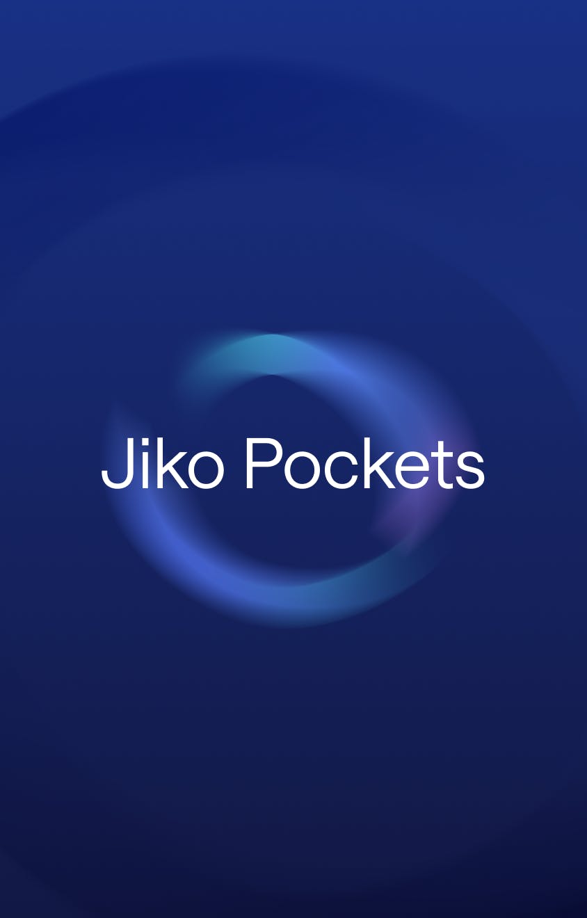
Jiko's core product is their Pocket, a combination of a bank and brokerage account. This is where the automated T-bill investment happens, but to the account holder it works just like a regular bank account.
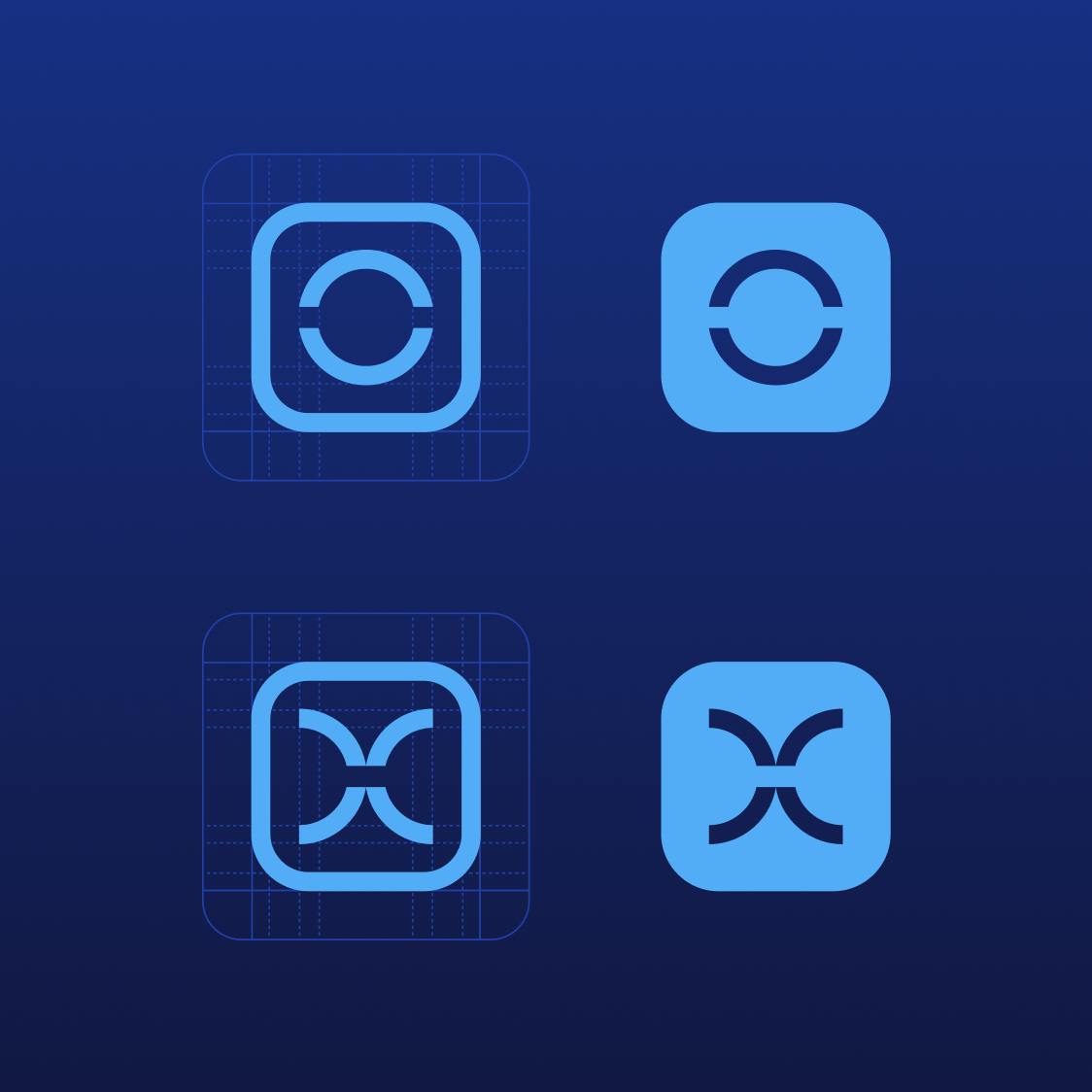
In Jiko's logo, the split O is meant to convey this core function of Jiko's platform, and we decided to extend the idea to the overall visual system of the brand. The background graphics that underlie the whole look and feel are based on abstractions of the split O, with a sense of movement that reflects the inner workings of the Pockets and the platform.